UI Experiment for PhoneGap Android App
I currently have a personal project which will almost certainly involve creating a mobile app. I'd ideally like to make it a hybrid native/Phonegap app to maximize the time spent writing cross platform code as apposed to duplicating work between different mobile platforms... The fact that the bulk of my experience is with the web technologies makes this much more appealing.
So in the short term I plan to prototype using just mobile browsers, but I wanted to get a bit of a feel for what the native app will be like.
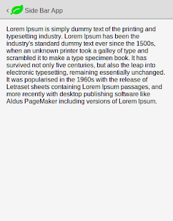
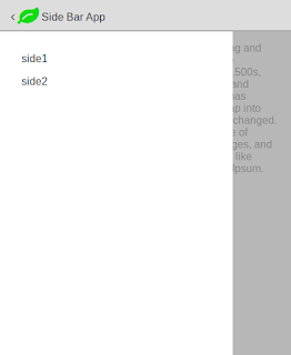
So my weekend work was creating this layout mockup on JSBin which I think is a pretty accurate representation of Android and also gave me an opportunity to play with some CSS transformations, which is something that I need extra practice with.
What next on this? Perhaps the menu on the left should only expand to a certian width depending on screen size and/or aspect ratio and it may well be that I can cut a bit more (HTML) fat out of it. Before doing this though I want to experiment putting content in first and see how it holds up, in any case I'm pretty pleased with how it turned out for a tiny weekend project.

